Home Environments
How to Choose the Ideal Colors for Your Home
Do you want to learn how to choose the perfect colors for your home decor? Check out these infallible tips that will help you create harmonious, cozy and personality-filled environments.
Advertisement
Many people feel insecure when combining colors, as they are afraid of making mistakes and ending up with a disastrous result.
It turns out that such doubt is natural, since the harmony of colors is fundamental to creating a pleasant and cozy environment.
To help you when adding colors to your home, we created this guide, which will accompany you and assist you in this process to make your home colorful and full of personality.
THE IMPORTANCE OF COLORS
Colors have the power to influence the emotions and mood of those who see them. Therefore, choosing the right colors in decoration can make all the difference in the environment.
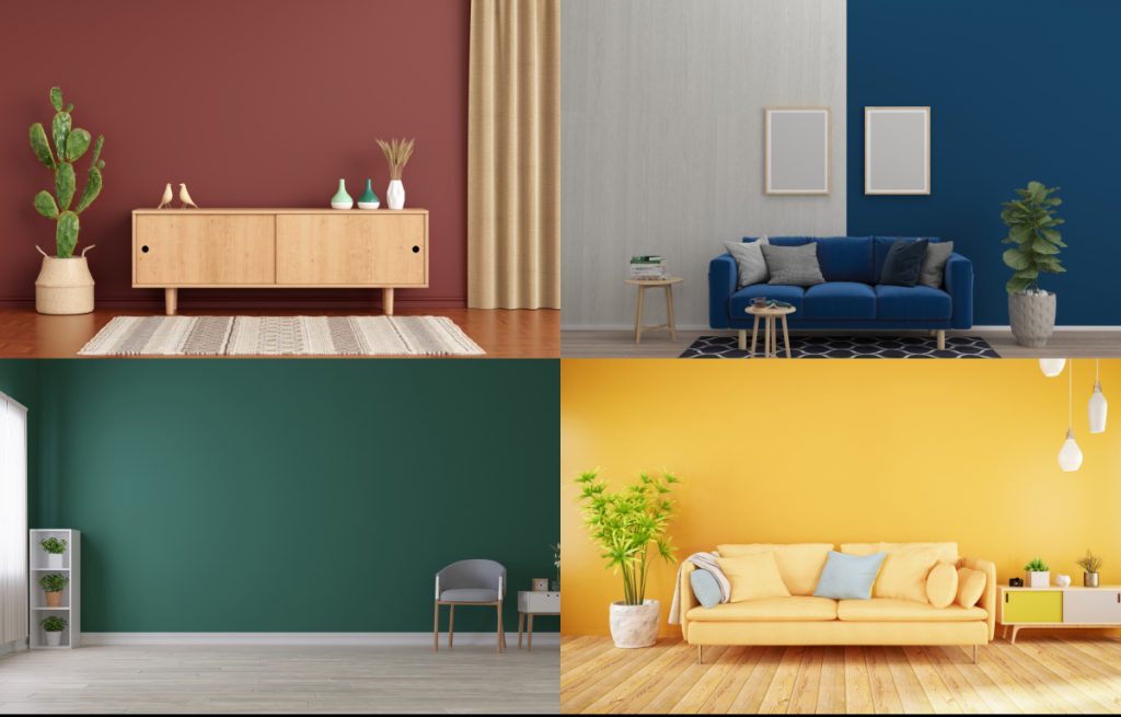
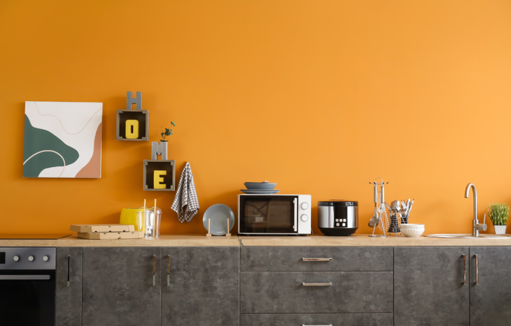
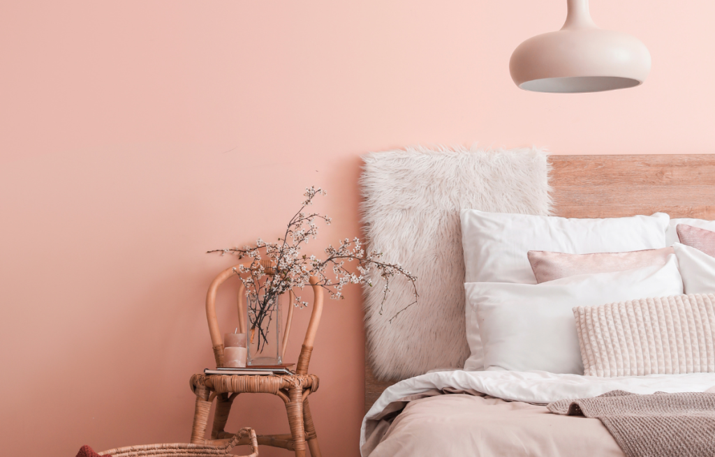
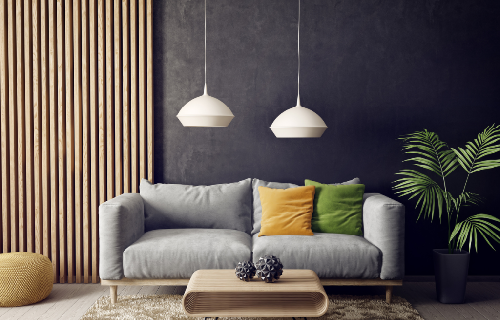
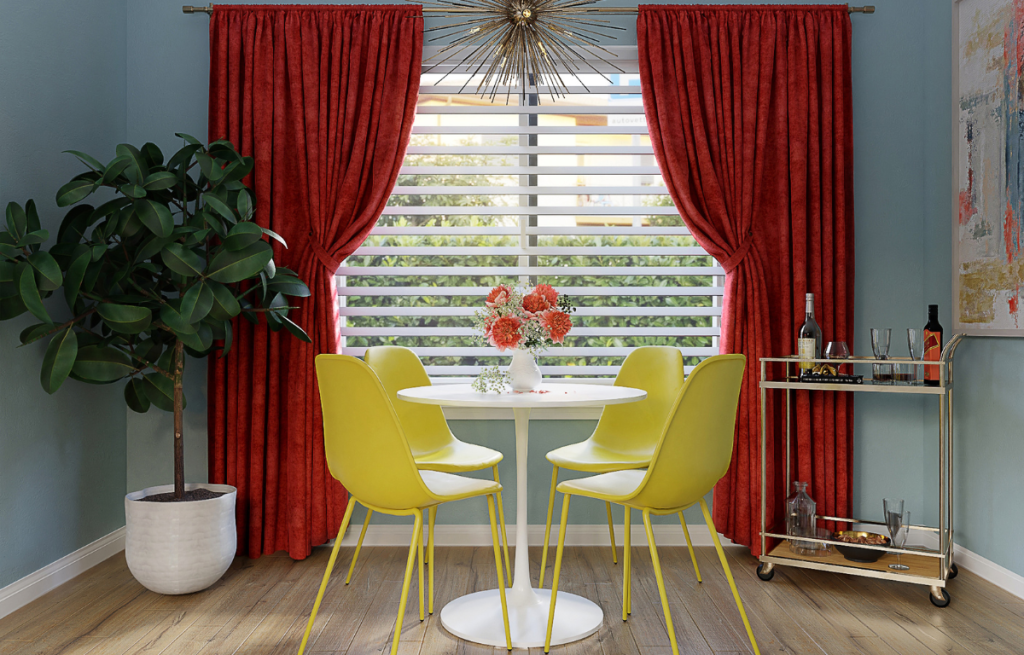
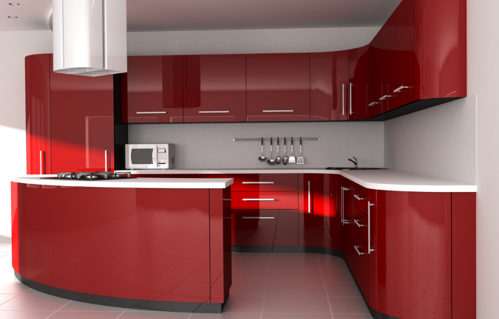
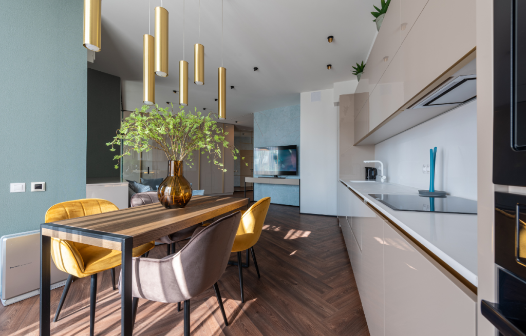
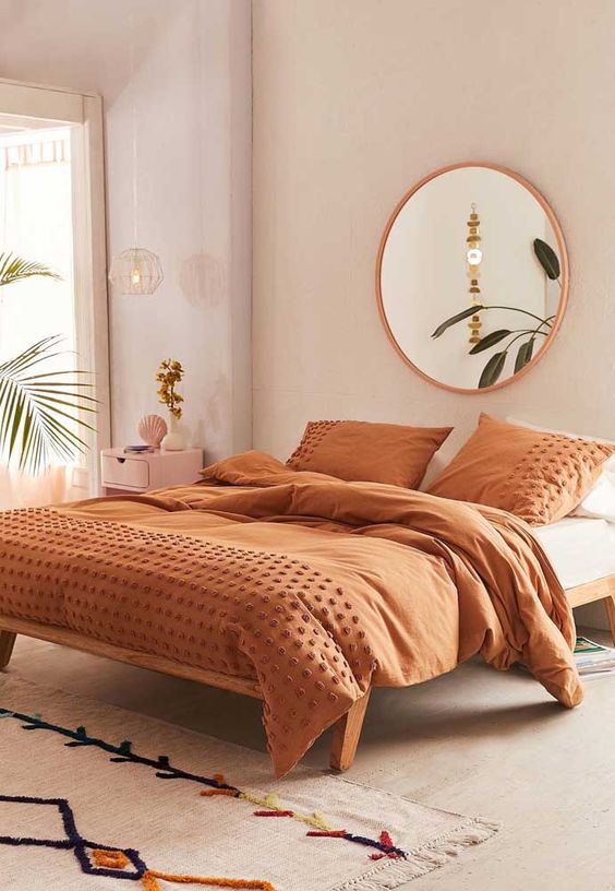
Hot colors: red, orange and yellow tend to bring a feeling of warmth, energy and joy. These colors can be ideal for social environments, such as the living room, where people often gather and chat.
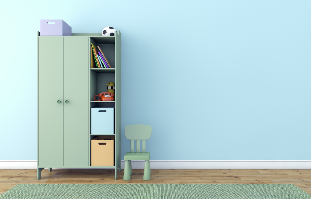
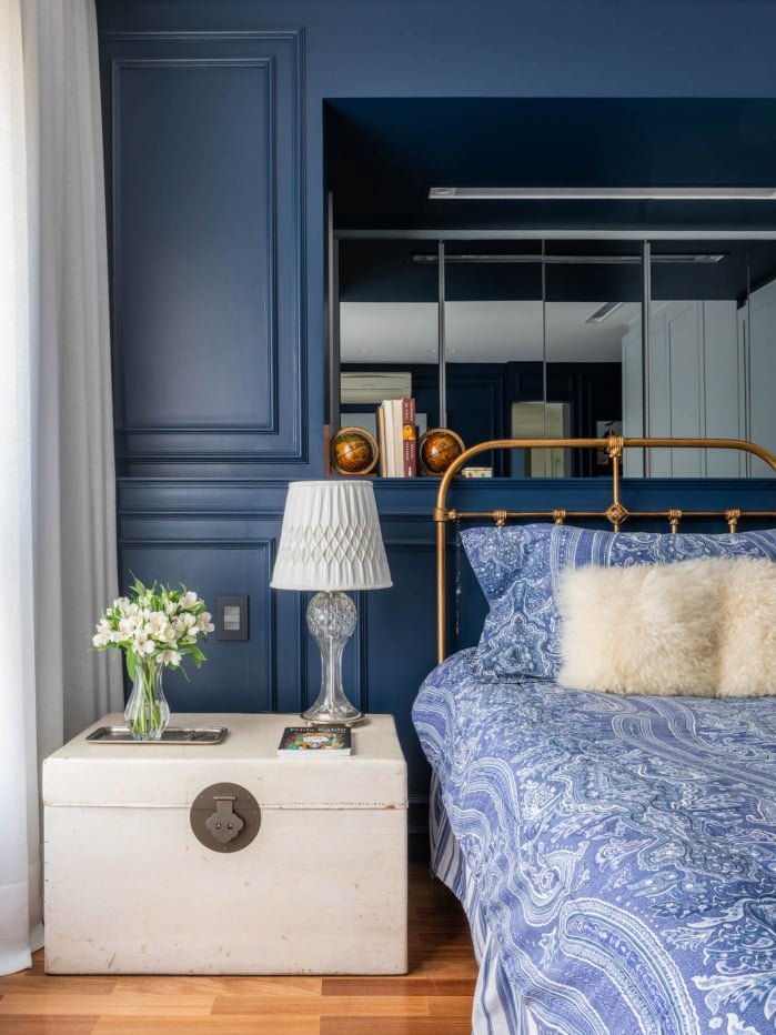
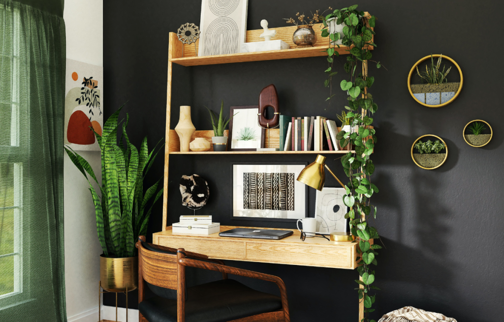
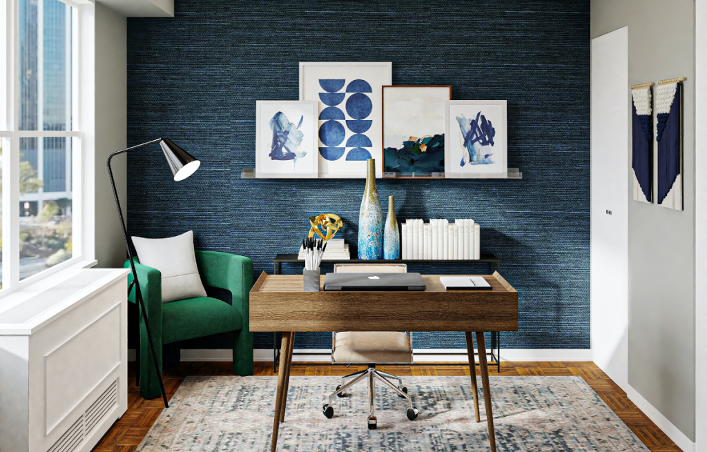
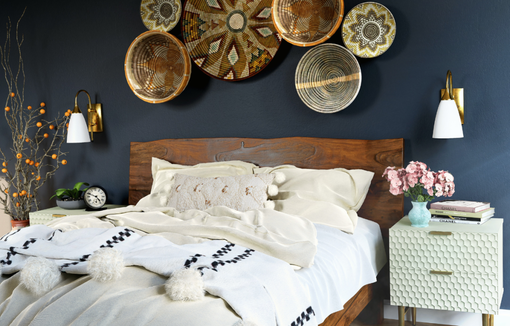
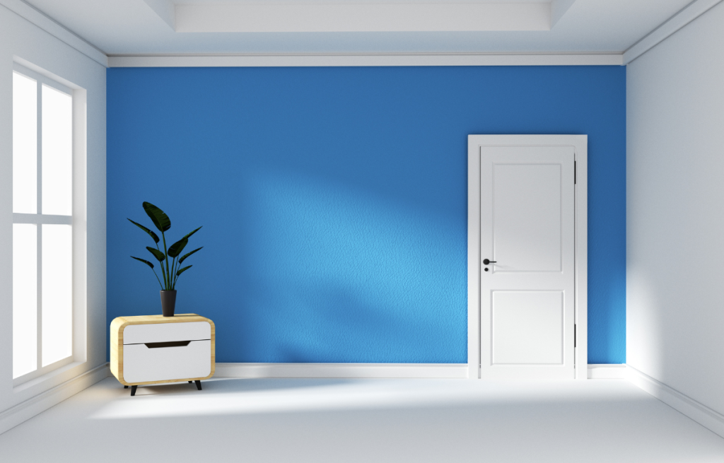
Cool colors: blue, green and purple, convey a feeling of tranquility, calm and serenity. These colors can be great for relaxing environments, such as the bedroom or TV room.
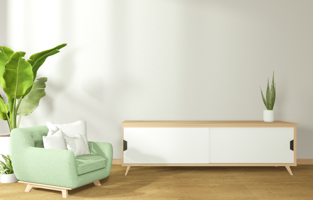
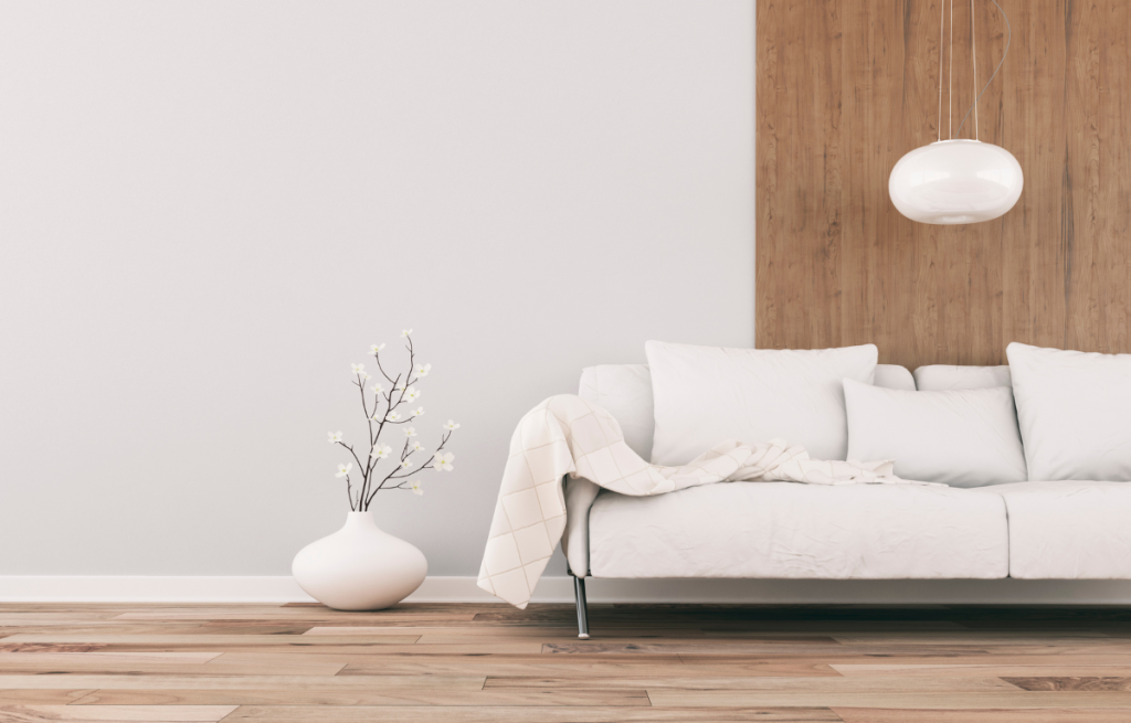
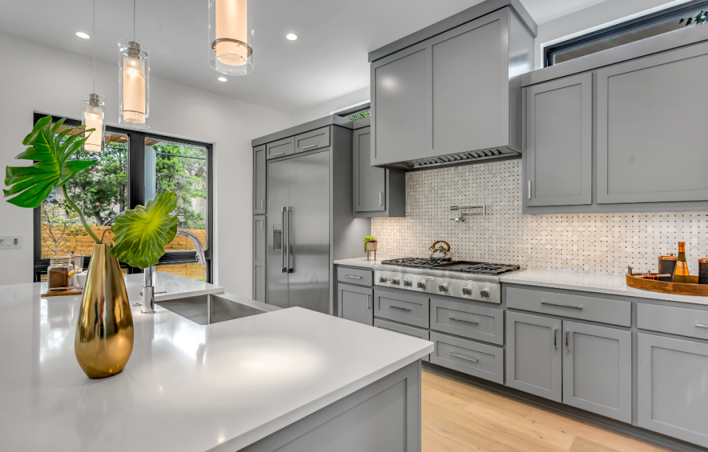
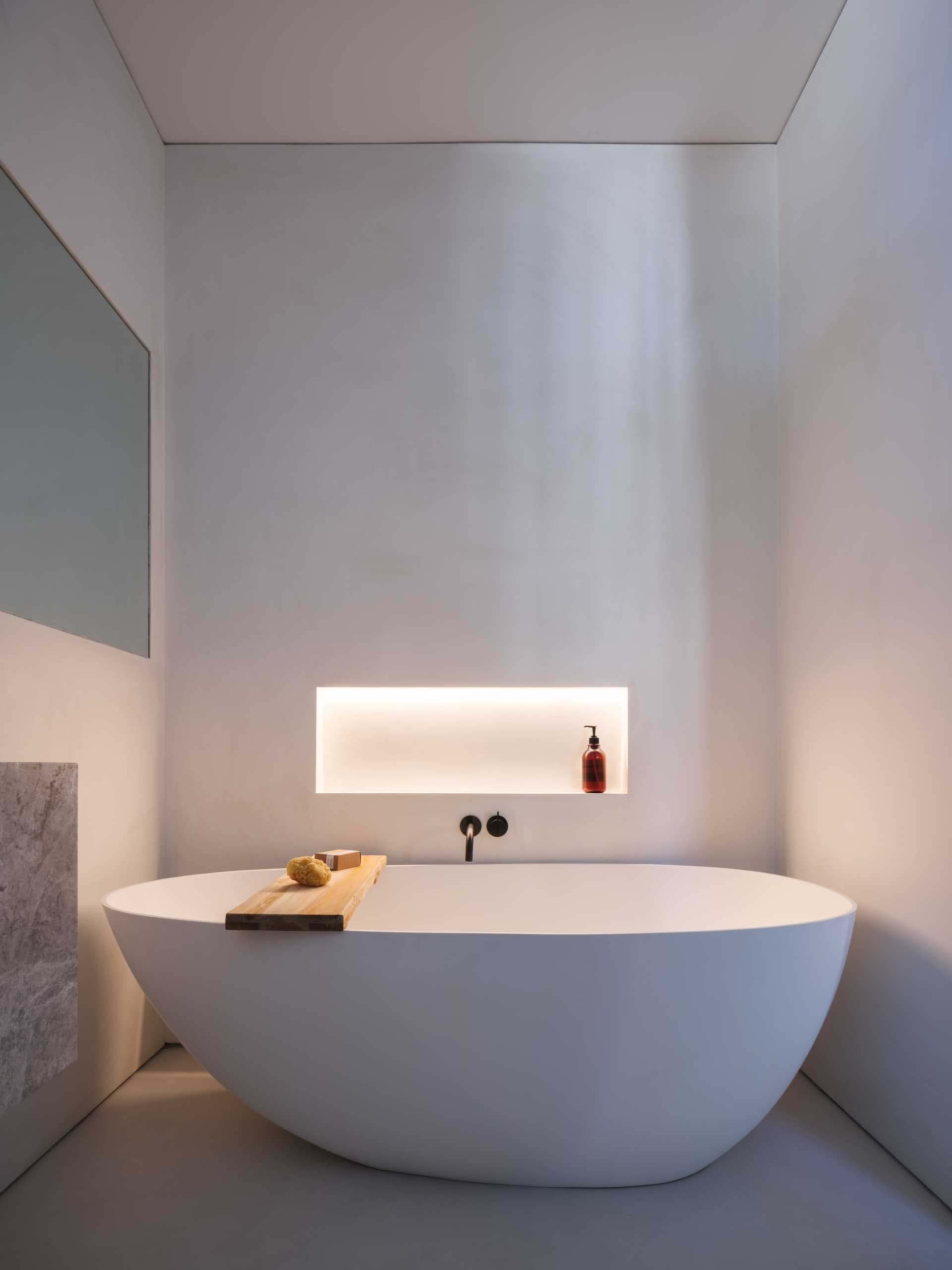
Neutral colors: white, gray and beige, they are versatile and easy to combine with other colors. They can be used as a base in decoration, bringing an air of sophistication and elegance to the environment.
Furthermore, there are colors that have cultural and symbolic meanings. For example, yellow is considered a color of happiness in Chinese culture, while black can be associated with mourning in some Western cultures.
When choosing colors for decoration, it is important to also consider the personality of who will use the space. Extroverted people may feel more comfortable in environments with vibrant colors, while more introverted people may prefer softer, more neutral colors.
BASE COLOR
Choosing a base color is a great way to start decorating a room. This color will be the main color in the color palette of the space, and can be used on walls, furniture or accessories.
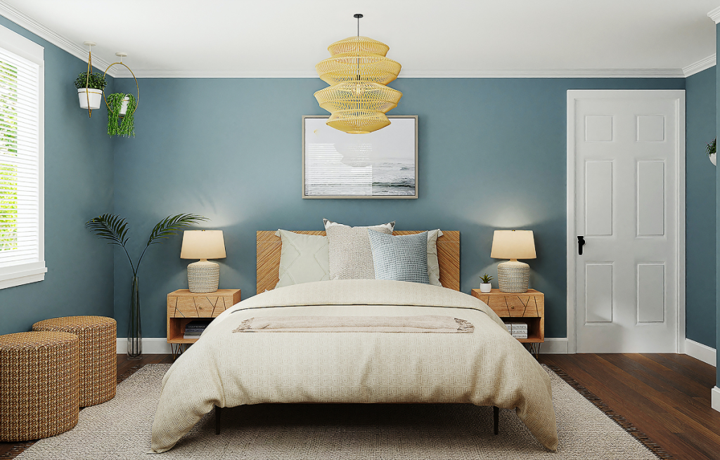
When choosing the base color, it is important to consider the feeling it conveys and how it fits in with the rest of the decor. For example, if you choose a shade of blue, it can be used to create a sense of tranquility and calm in the room. If you prefer a more energetic and vibrant environment, you can opt for a shade of yellow or orange.
Using the base color, it is possible to create a harmonious color palette for the room. You can choose lighter or darker shades of the same color, or combine it with other colors that complement each other, such as analogous or complementary colors.
Also remember that colors don't just have to be used on walls. They can be used in furniture, accessories, paintings and even in ambient lighting. The important thing is that the color palette is balanced and creates a pleasant feeling in the space.
With the base color chosen, you can explore different shades and combinations to create a personalized environment that suits you.
ENVIRONMENT SIZE
It is important to take the size of the room into consideration when choosing colors for decoration. In small spaces, it is recommended to opt for light and soft colors, as they help to give a feeling of spaciousness and make the space more airy. Pastel, white, beige and light gray tones are great options for this type of environment.
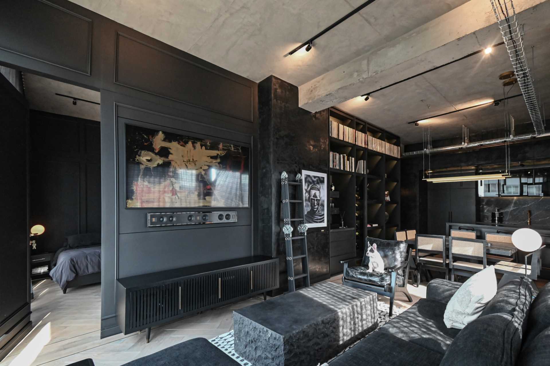
In larger environments, the options are more varied and you can be a little more daring with the colors. Darker or stronger tones can be used without fear, as the space can accommodate more intense colors without seeming suffocating. Colors such as navy blue, olive green and marsala are some options for larger environments.
However, it is important to remember that dark colors tend to absorb more light and can make the room darker, so it is recommended to balance them with lighter colors or good lighting.
Additionally, you can use colors strategically to create interesting visual effects. For example, a wall in a darker tone can create a feeling of depth in the room, while a wall in a lighter tone can highlight furniture and decorative objects.
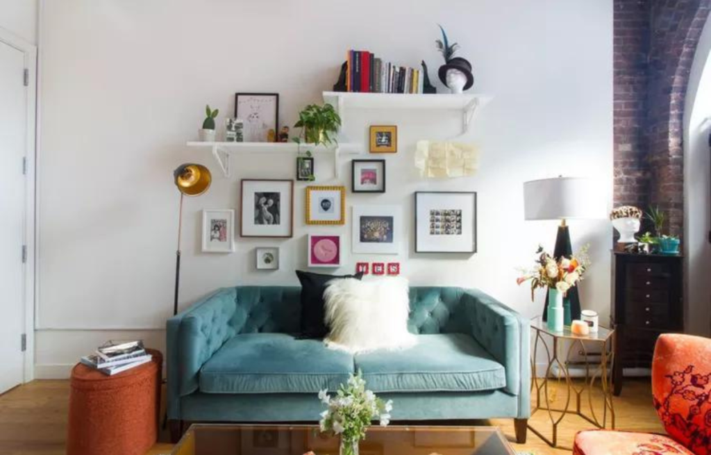
Eclectic Vintage Decor
Combining antique objects with modern pieces can bring a unique and elegant touch to your home decor.
CONTRASTING COLORS
Combining contrasting colors is a technique that can add a special touch to the decor and create a more interesting and dynamic look. When you mix two colors that are on opposite sides of the color wheel, like blue and orange, or green and purple, you create a strong, impactful contrast.
However, it is important to use this technique in moderation and balance. One tip is to choose one color to be the predominant one and use the other in details, such as decorative objects, cushions or an accent wall.
It is important to take into account the style of decoration and your own personal taste when choosing contrasting colors. Brighter and bolder colors can create a more modern and relaxed environment, while softer colors can create a more delicate and romantic environment.
Another tip is to consider the lighting in the environment when choosing contrasting colors. Cooler lighting can accentuate the contrast between colors, while warmer lighting can soften it.
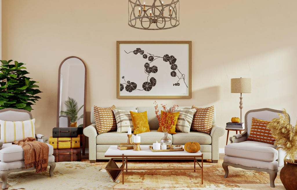
60-30-10 RULE
The 60-30-10 rule is a technique widely used in decoration to create a balanced and harmonious color palette. This rule consists of dividing the colors used into three parts: 60% of a dominant color, 30% of a secondary color and 10% of an accent color.
The dominant color is the color that will predominate in the decoration, generally used on walls, furniture or carpet. This color should be neutral or soft, such as shades of beige, gray or white, so as not to tire the eyes and create a welcoming environment.
The secondary color is used in furniture, curtains or carpets, and must be a complementary color to the dominant color. It may be a little stronger, but it should still be in harmony with the dominant color.
Finally, the accent color is used in decorative objects, such as cushions, paintings or vases. This color can be bolder and more vibrant, and is responsible for bringing personality and joy to the environment.
By following this rule, you can create a balanced and harmonious color palette, without exaggerating with strong colors or overloading the room. Additionally, you can use different shades of the same colors to create variations in the decor and make it more interesting.
It is worth remembering that the 60-30-10 rule is not a rigid rule, but rather a guideline to help when choosing colors for decoration. The important thing is that the colors chosen are in harmony with each other and reflect your personality and style.
TEST COLORS BEFORE PAINTING
Testing colors before painting or choosing furniture is essential to avoid unpleasant surprises. This happens because colors may appear different depending on the lighting in the room.
For example, a color that appears soft and calm in daylight may become more intense and vibrant in artificial light, which can cause visual discomfort and imbalance in the decor.
Therefore, it is important to always test colors before painting the walls or choosing furniture. You can buy small samples of paint or fabric and paint a section of wall or upholstery to see how the color looks in the room at different times of the day.
It is also important to consider the combination of colors with the objects and furniture in the environment, to avoid visual conflicts or excess information. Remember that the color should complement and not compete with the elements already present in the space.
Sophisticated Decor Without Spending Much
With a few simple tips and tricks, you can transform a space without spending a lot of money.
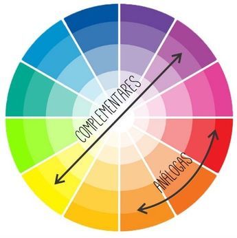
CHROMATIC CIRCLE
The color wheel is a useful tool to help choose colors that go well together. It is made up of several colors arranged in a circle, like the colors of the rainbow.
To use it, simply choose a color that you like or that is needed for your project, and then look at the colors around it in the circle. Colors that are close to your chosen color are called “analogous” colors and generally go well together.
If you want to create greater contrast, choose a color that is directly opposite your starting color on the color wheel. These are “complementary” colors and can create a vibrant contrast when used together.
Choosing colors largely depends on your personal taste and what you are trying to achieve. The color wheel is just a tool to help guide your color choices, but creativity and common sense are always important!
Chromatic circle
Trending Topics

Christian Mingle App: Serious Relationships for Christians
Find like-minded Christians on Christian Mingle, the ideal app for those seeking serious, faith-based relationships
Continue lendoYou may also like
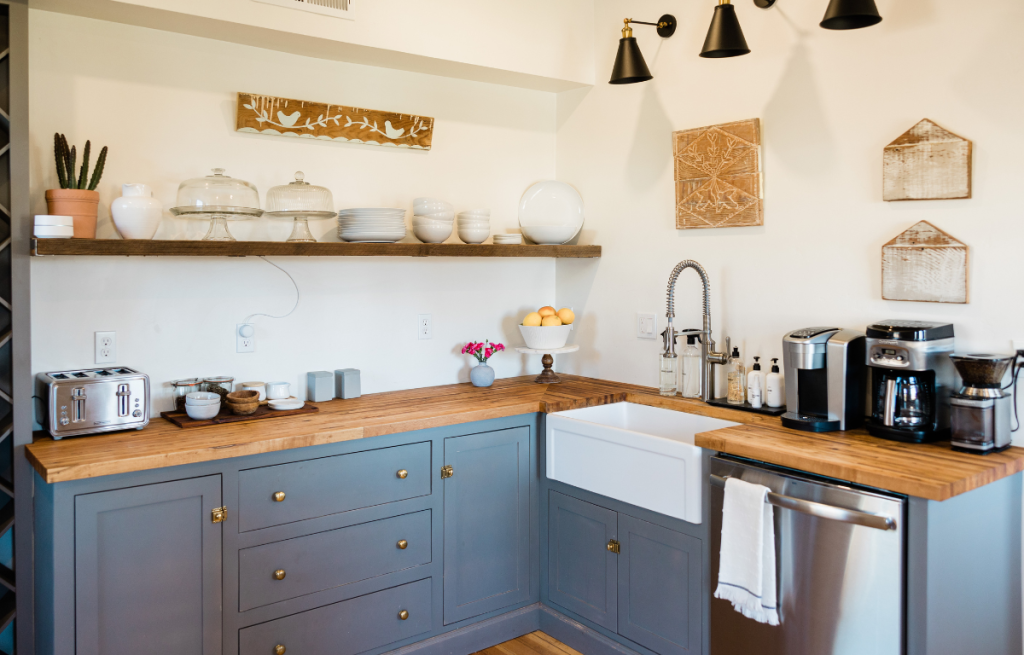
Modern Kitchen: How to Create a Contemporary and Elegant Environment
Everything you need to know to have a modern kitchen.
Continue lendo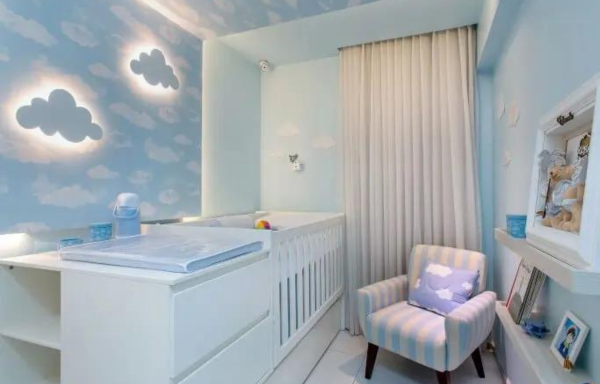

Christian Radio Apps: Real-Time Faith, Wherever You Are
Listen to live Christian radio stations on your cell phone with praise, messages and sermons 24 hours a day. Faith and worship anywhere.
Continue lendo