Decorating styles
8 Options Beyond Gray and White for Fans of Neutral Decor
Colors that will bring calm and balance to your home.
Advertisement
If you, like me, want your home to be a haven of tranquility, you probably also prefer walls in neutral tones like gray and white.
But look, having a calm and discreet interior doesn't mean we have to give up on colors. There are a lot of cool options if you want to liven up the space, while still maintaining that softer tone.
So, let me tell you: I've selected eight very interesting ideas, ranging from light pink and green to more intense colors like burgundy and chocolate brown. For each one, I chose some photos so you can see what it looks like in real life, and I even selected some shades to inspire you.
But, an important warning first: remember that light makes a huge difference in color, right? The same tone can completely change its appearance depending on the space, lighting, and even the time of day.
So, my tip is: do a test on a part of the wall, observe how the color changes from dawn to dusk and only then decide if it's the one you want.
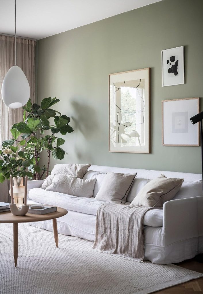
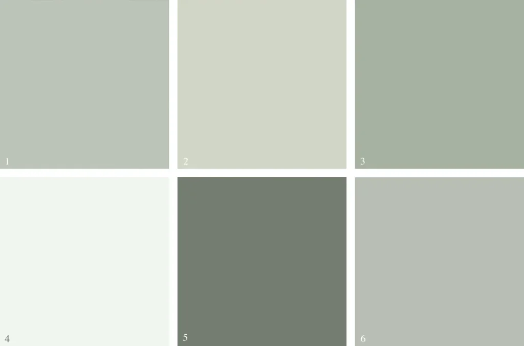
Soft Green
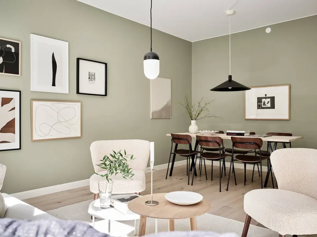
Green is, without a doubt, one of the most relaxing colors, do you know why? Because it takes us directly to nature – it is the color of fields, dense forests and majestic mountains.
It creates a very special connection with the natural world and brings a vibe of balance and harmony into the home; It has even been proven that it is good for health and well-being.
There are studies that show that greenery relieves stress and even helps hospital patients recover faster.
If you're looking for something really calming, opt for greens with a gray or blue base – those with a cooler tone. Delicate mint pastels and soft sage greens are also safe bets. They look great in places like bedrooms and bathrooms, where providing relaxation is essential.
Possible shades:
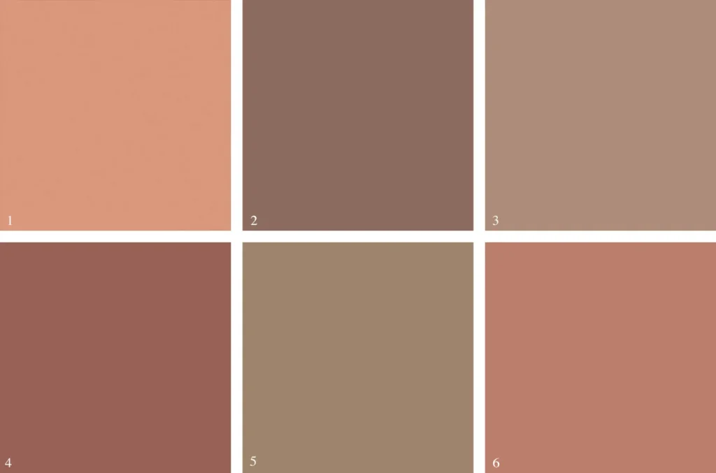
Terracotta
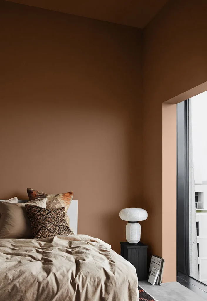
It may seem strange at first, but an orange-based color, like terracotta, is a worthwhile idea for those who enjoy more neutral environments. This is because her more earthy feel has a welcoming feel and, at the same time, is relaxing.
Look for softer tones that lean toward peach or brown. These colors fit like a glove in rustic spaces, but, as you can see in the photos, they also look very beautiful in contemporary and urban environments.
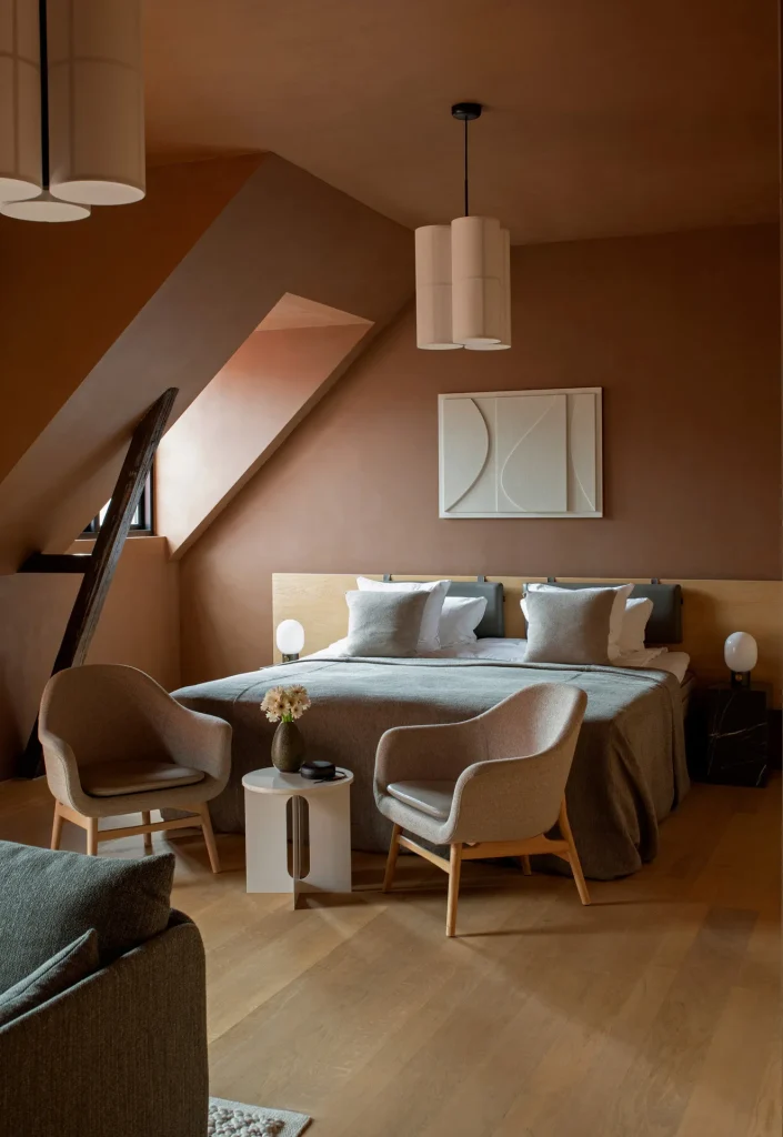
Possible shades:
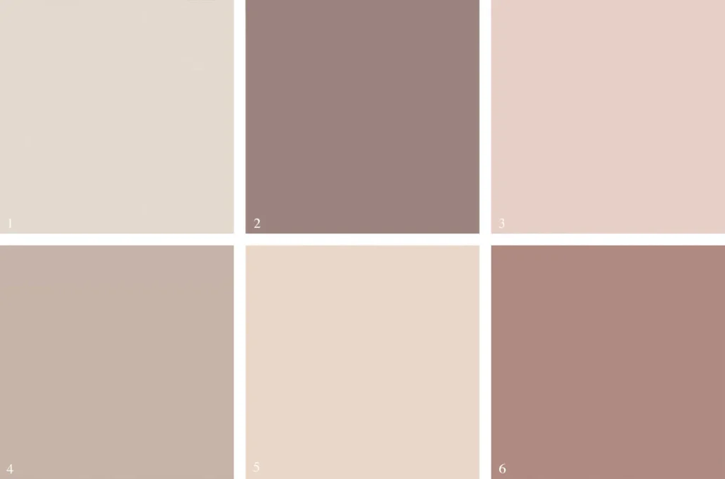
pink
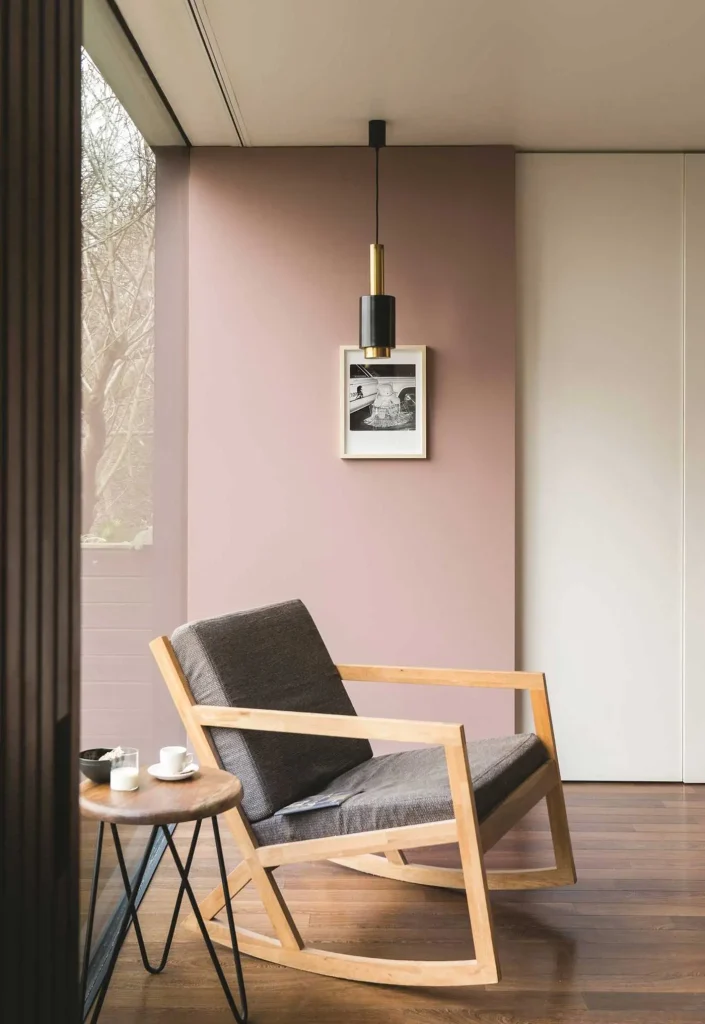
Pink is super versatile. It's so popular that it's kind of become a new neutral.
And I'm not talking about that vibrant bubblegum pink, but the more sober and elegant tones – a very soft or light pink.
These are tones that warm up the environment and also bring peace. And it looks great combined with gray, beige and white, as well as light wood furniture.
If you want to go bold, these shades of pink also go really well with darker colors, like rust red, deep blue or forest green.
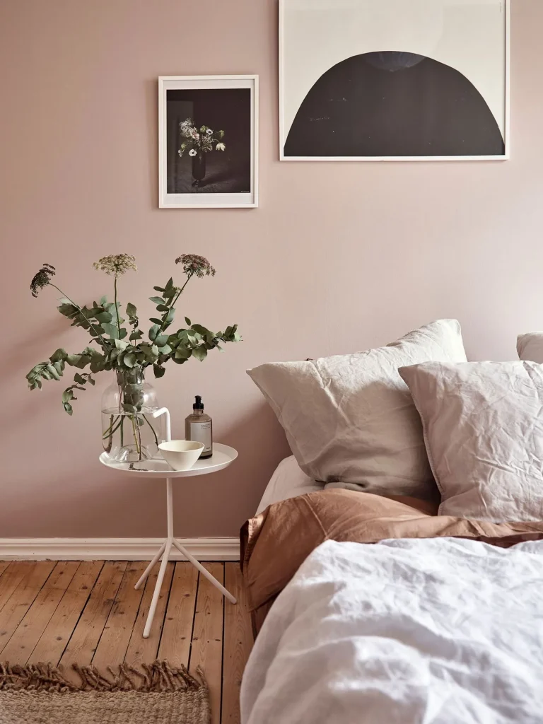
Possible shades:
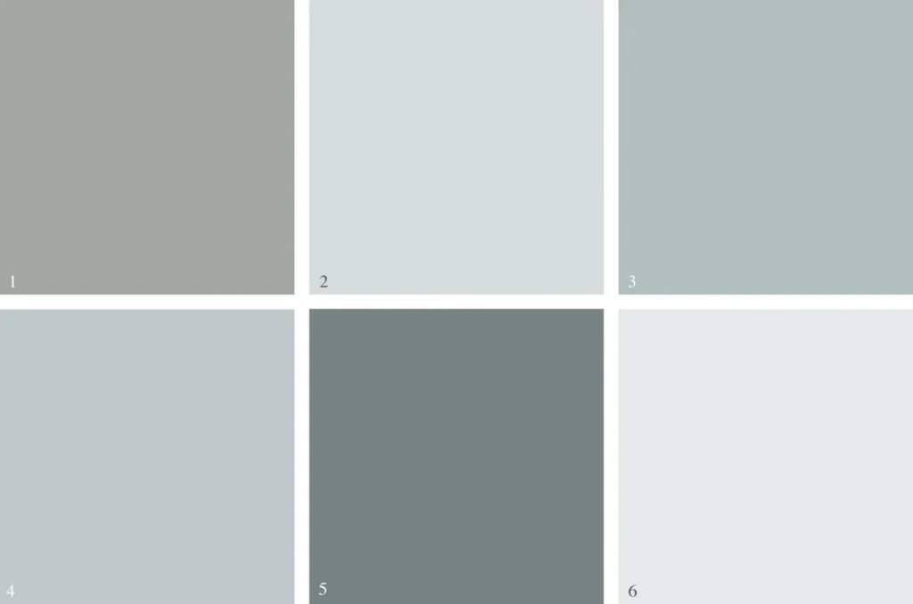
Soft Blue
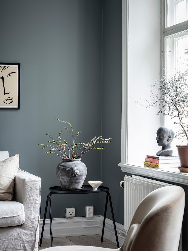
Just like green, blue is a color that has everything to do with nature. It manages to be relaxing and at the same time boost your mood. Furthermore, blue is a timeless choice, it has always been in decoration and never goes out of style.
There are many more discreet tones, like silvery blues that remind us of the winter sky, to darker ones with a green or gray background, which remind us of seas, lakes and rivers.
And it looks beautiful when you add some details in bright white or some striking touches in black, or even as a backdrop for furniture in shades of brown.
Blue is perfect for balancing out very bright environments, but in darker rooms it can be a little cold, so it's good to choose the tone carefully, right?
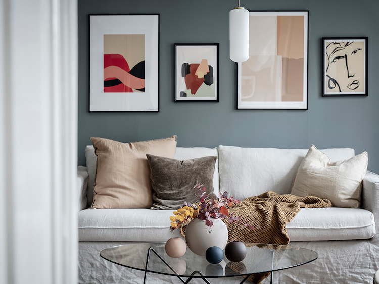
Possible shades:
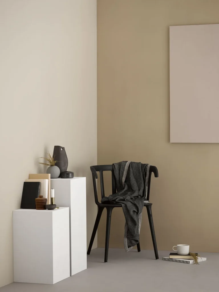
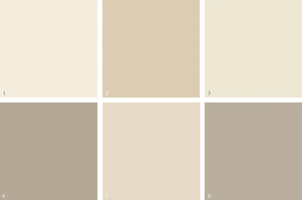
Beige
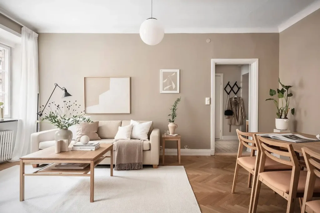
Many people turn their noses up at beige, thinking it's boring, but it has its charm. If you want something more discreet and are unsure between white and gray, beige could be a cool option.
And there isn't just one shade of beige, right? It has a lot of variations: from very light creams and taupes to warmer tones like caramel, honey and sand.
Some beiges have a more golden vibe, others are colder, more like pink or lilac – so there is beige for every type of environment. Just be careful not to choose a very yellowish tone, especially if the room gets a lot of sun, to avoid having that old 70s decor look.
Most shades of beige look great with wooden furniture and natural materials. But if you want something more sophisticated, try combining beige with gray and black, like the example in the image below:
Possible shades:
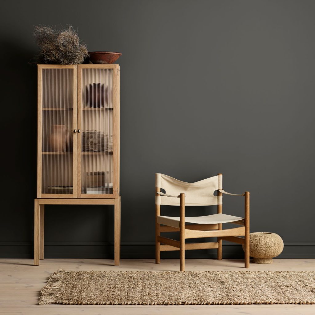
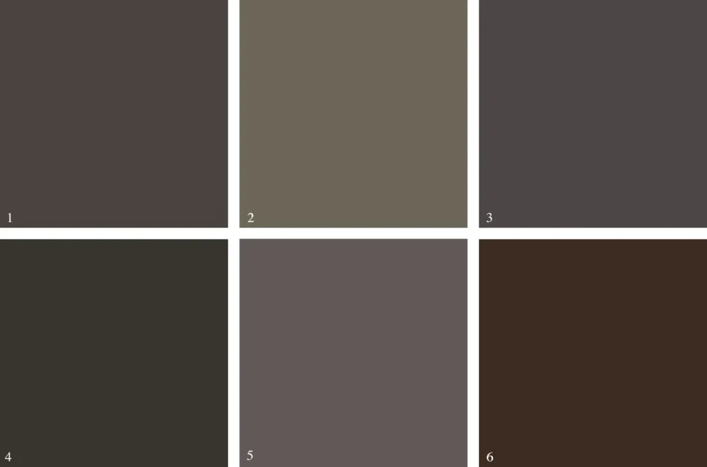
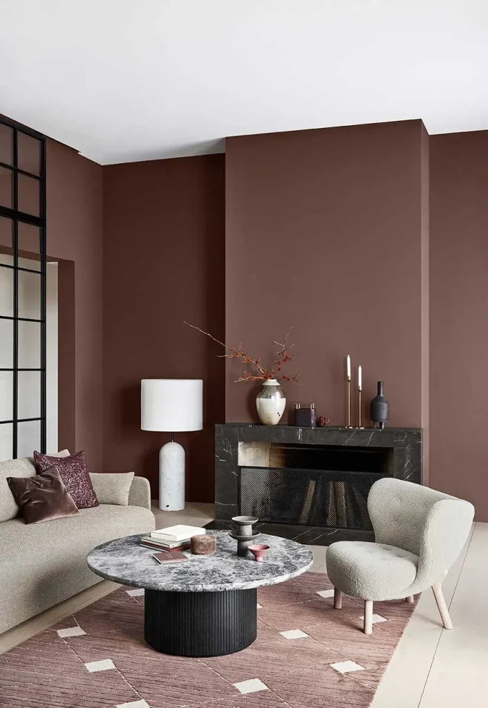
Chocolate Brown
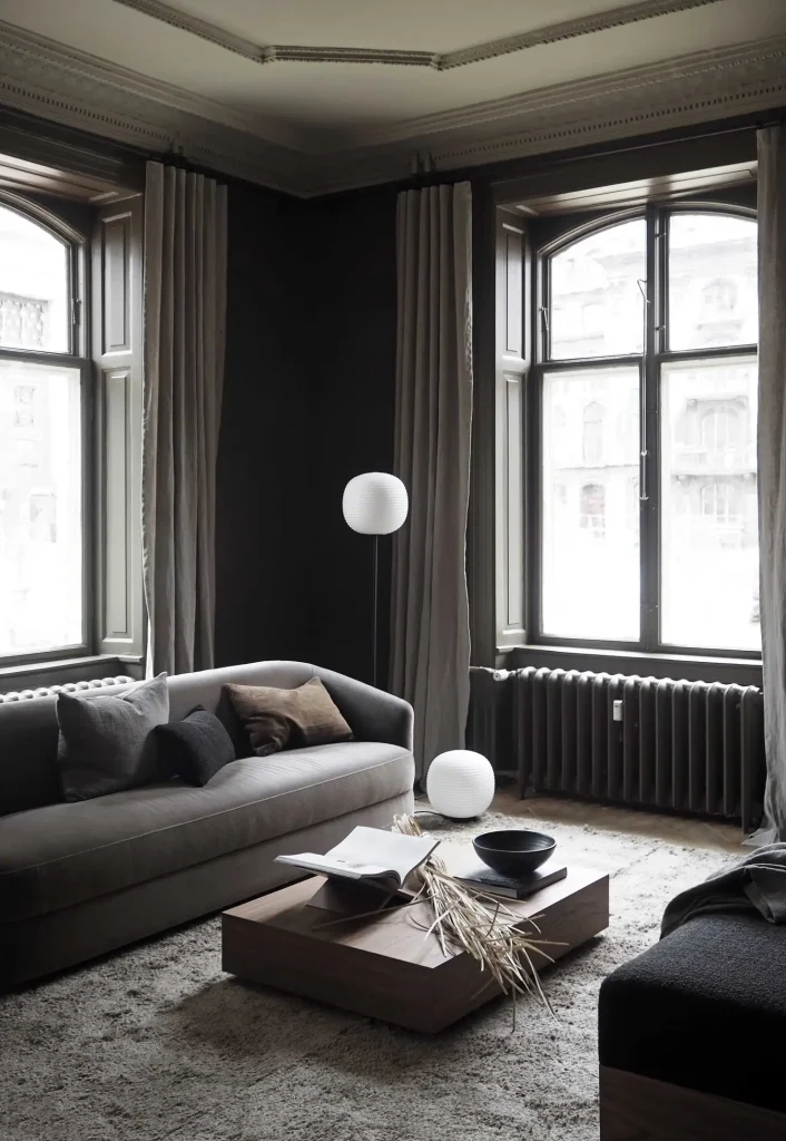
And if you want to be more daring, how about a chocolate brown? It may seem like painting a wall such a dark shade is radical, but the effect is softer and warmer than you might think.
And it has several nuances. From the redder versions to those that tend towards gray or green. So, whatever the light or environment, there will probably be a shade of chocolate brown that fits like a glove.
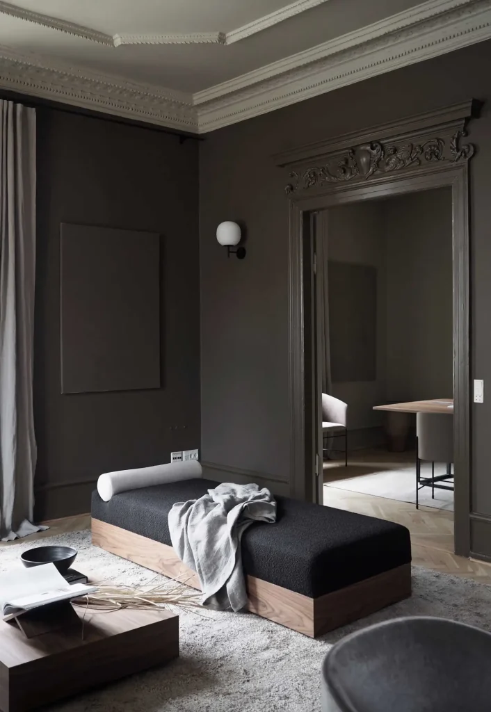
Possible shades:
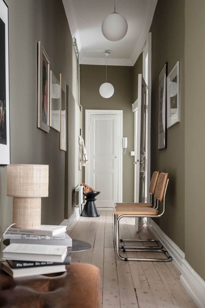
Khaki and Olive Green
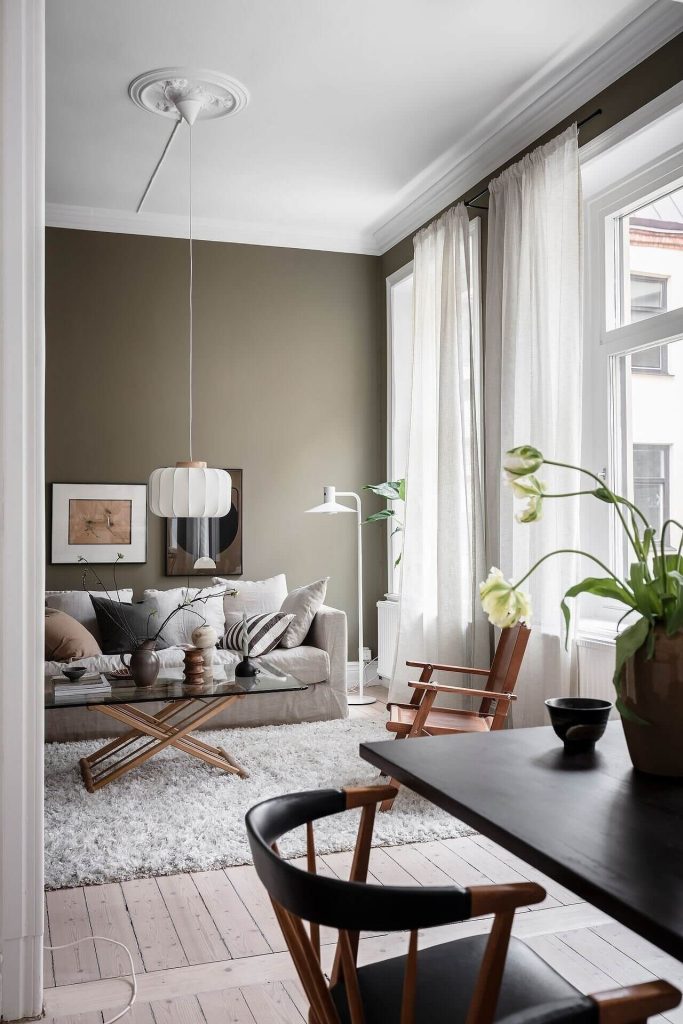
I've already talked about soft greens with that bluish or grayish touch, but we can't forget the greens that have a brown base, like khaki and olive.
They're perfect if you're looking for something a little warmer and cozier. Just try to avoid those that are very yellow if you don't want to draw too much attention.
They go really well with heavy wooden furniture, but I really love seeing this combination with beige and black, it looks incredible!
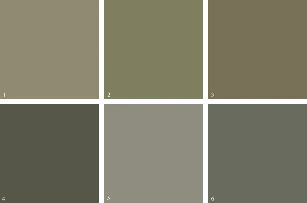
Possible shades:
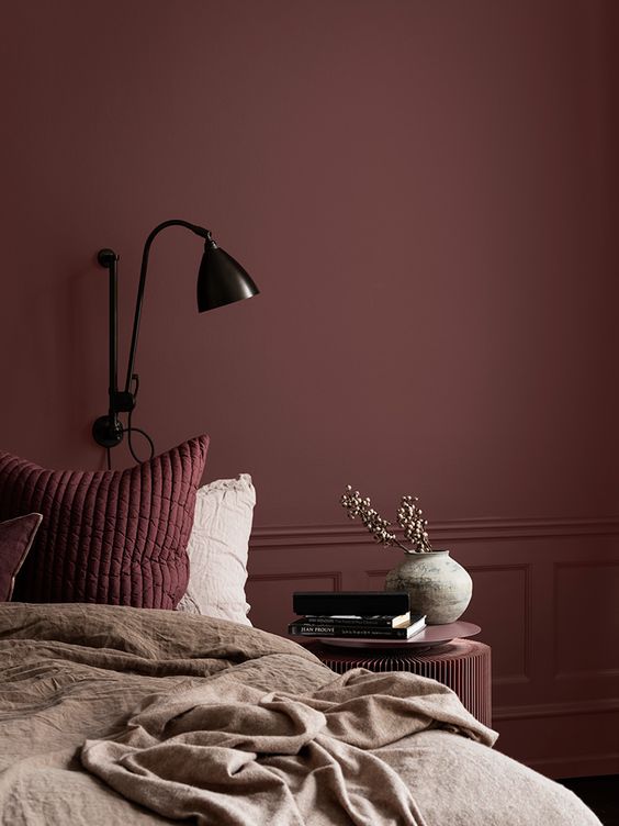
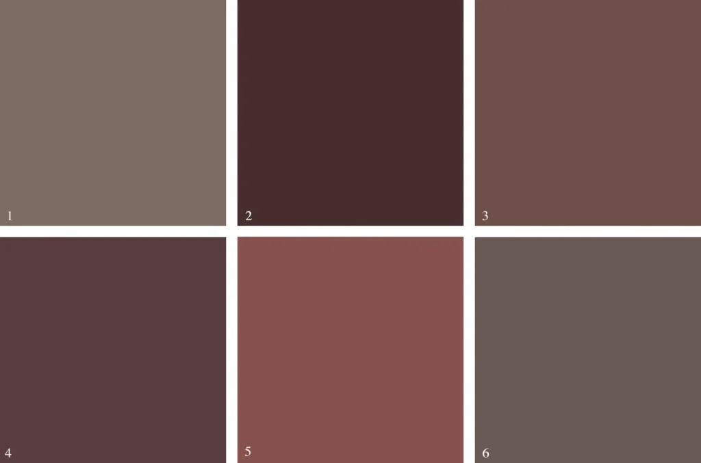
burgundy
If you're thinking about venturing into darker colors, have you thought about giving wine nuances or even that plum-like purple a chance?
Many people associate reddish tones with that air of drama and passion, but the tones that lean towards the browner side are much more sober. They bring a more rustic feel, a calm charm that manages to be chic and cozy at the same time.
They add incredible depth to the space, but with a feeling of comfort. How about taking a risk and painting all the walls this color? Or, if you prefer something softer, mix it with some white and beige details.
Possible shades:
Trending Topics

See how to reduce your electricity bill
See how to reduce your electricity bill by up to 95% in a safe and sustainable way. You can't miss this chance!
Continue lendo
Renting Luxury Homes on Airbnb: Comfort, Sophistication and Unforgettable Experiences
Discover high-end homes to rent on Airbnb and enjoy a premium and unforgettable accommodation experience.
Continue lendo
Be2 App: Scientific Matchmaking!
Find compatible partners on Be2, a dating app that uses scientific matchmaking to create lasting connections.
Continue lendoYou may also like

Christian Radio Apps: Real-Time Faith, Wherever You Are
Listen to live Christian radio stations on your cell phone with praise, messages and sermons 24 hours a day. Faith and worship anywhere.
Continue lendo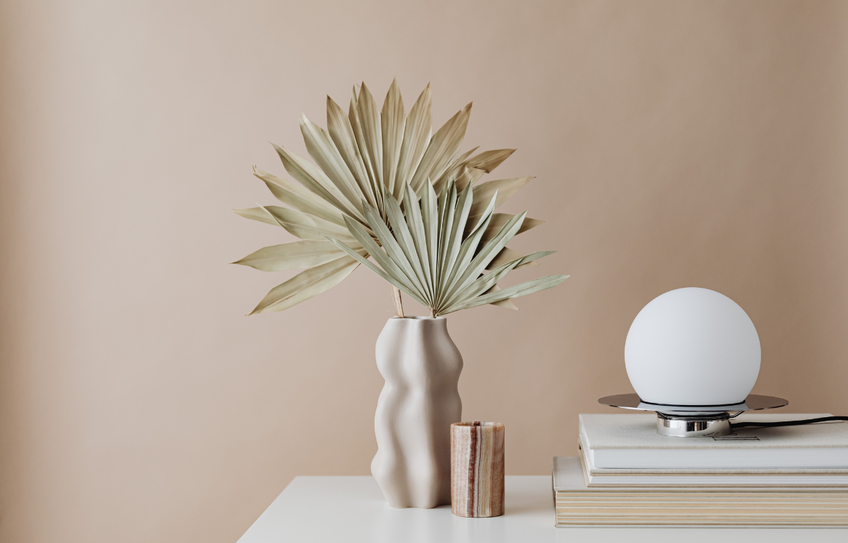
Minimalist Decoration: Do You Know What It Is?
Less is more - the simplicity and functionality of minimalist decor create an environment that inspires peace, calm and balance
Continue lendo